

A "Patient Powered" Clinical Trial
RadComp is a long-term, randomized clinical trial comparing two types of radiation therapies for breast cancer. Traditional photon radiation can damage the heart and other healthy tissue. Proton radiation is more targeted, and may prove to be less damaging to the heart. Study participants will be followed for at least ten years after completing radiation therapy.

The primary audience is female patients, aged 40 to 75, who have breast cancer. We wanted potential participants to feel safe, positive, and hopeful when they see the logo and learn about the study. The logo needed to be engaging, warm and welcoming. Not hard-edged, "techy", grandiose or institutional. And definitely not pink.
The RadComp study is particularly unique because the researchers will include study participants in the design and conduct of the study. It will be truly "Patient Powered".
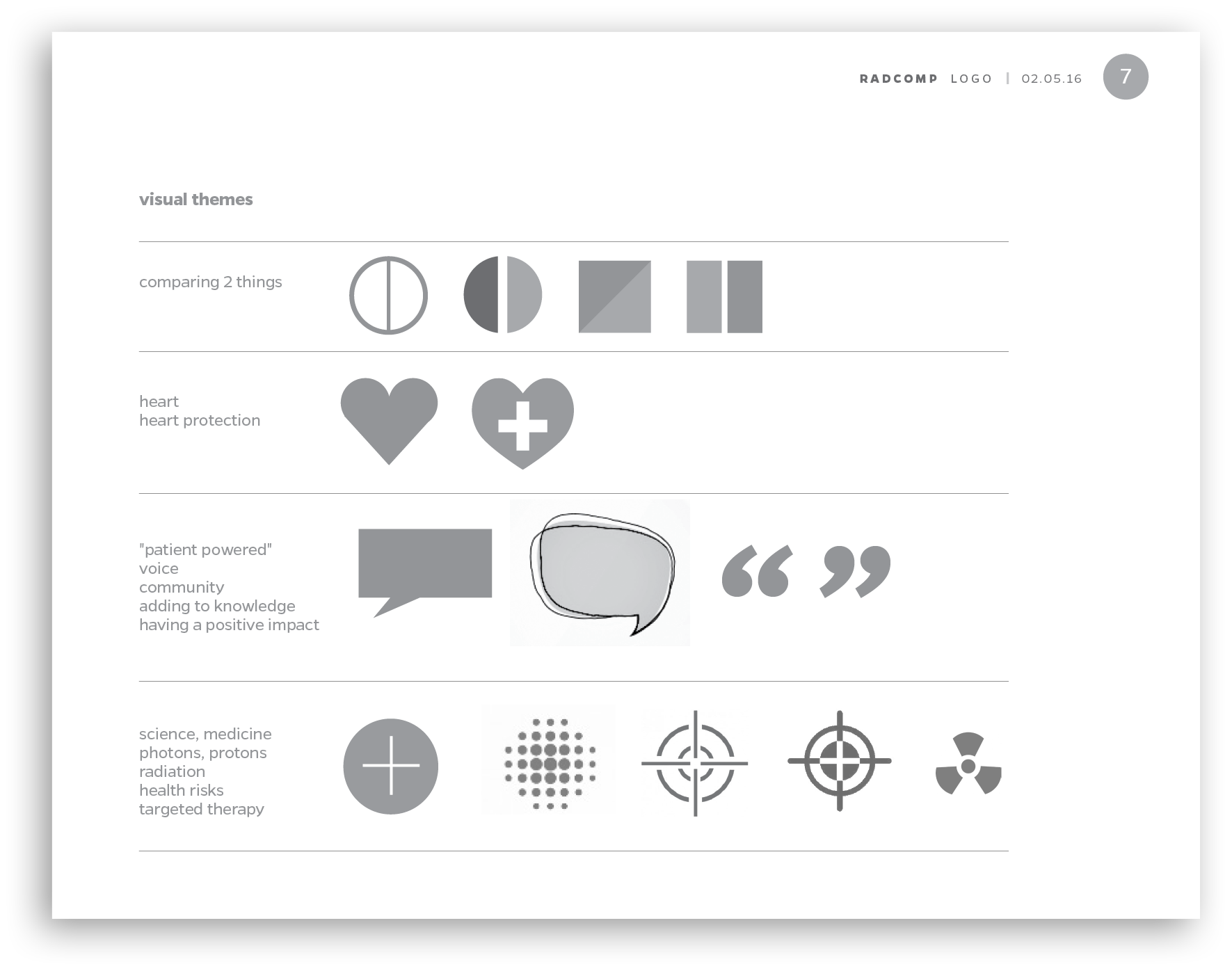
From early conversations and sketches, core themes emerged: making comparisons, heart protection, the patient voice and the pin-point accuracy of the newer technology.
One of my sketches combined a heart with a chat bubble. Using that to heart / bubble replace the "o" in RadComp started to pull the concepts together.

Type studies explored several typefaces that conveyed warmth and friendliness. Applying small caps to the "R" and "C" revealed a solution that had authority without being heavy-handed. Archer proved to be the most appealing typeface with bold but rounded characters, and many, many options for fine-tuning the type weight.
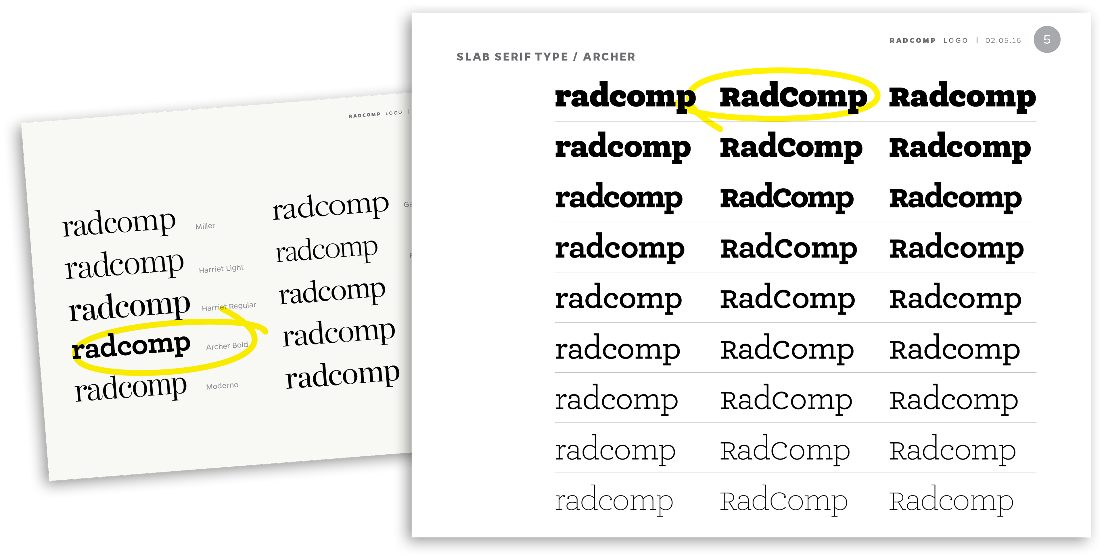
Reducing the height of the ascender on the "d" and the descender on the "p" customized the typography for a more cohesive, compact appearance.

The "heart chat bubble" lends itself to creative uses in addition to the formal logo.

A crucial test of every logo design is how well it works in final applications. The RadComp product line was an imaginary exercise, but helped demonstrate the logo's friendly, outgoing attitude. I secretly hope they make the hoodies.
