
CIO, redesigned
CIO magazine serves an audience of Chief Information Officers in Fortune 1000 companies. Launched in 1987, the magazine defined and supported this critical new role as CIOs became essential members of every successful business.
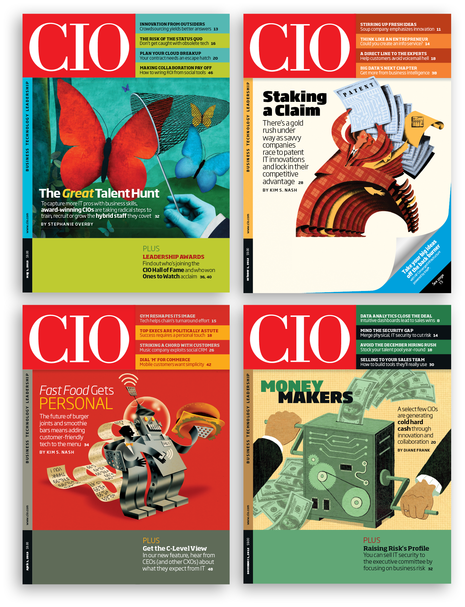
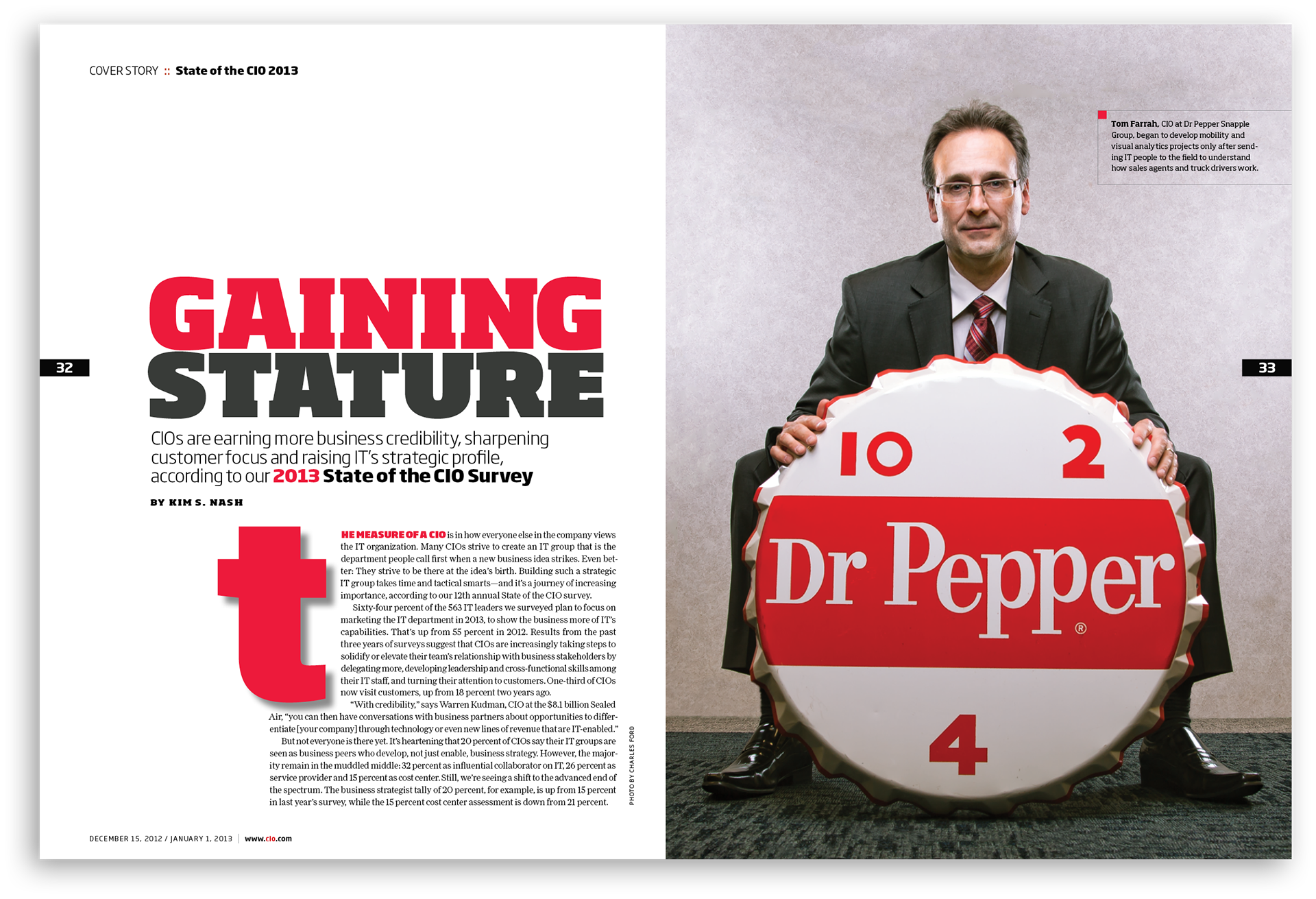
My team redesigned CIO several times to stay current. In 2009, we completely reconsidered the magazine content and design, front to back. The redesign features new sections with shorter stories, graphically engaging entry points and new typography. These covers and layouts by Art Director Terri Haas showcase the possibilities of the new design.

The Logo
CIO's logo hadn't changed since the magazine's launch in 1987. We removed the inline rule to make it more modern and easier to render online and in social media. The color was updated to a spicier "Ferrari" red.

Bringing Stories to Life
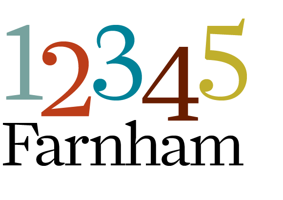
The redesign started with type studies and grid formats that would let the new multi-part sections really shine. Sebastian Lester's (no relation) Soho family provided both a full-bodied slab collection as well as a beautifully coordinated sans serif. David Berlow's Moderno FB added the sophisticated, tailored flair the magazine has always been known for. Moderno resonates nicely with the modified Bodoni used in the logo and adds a lively voice to the pages. The new font set was an excellent partner to Christian Schwartz' beautifully crafted Farnham Text which we still loved from the previous redesign.

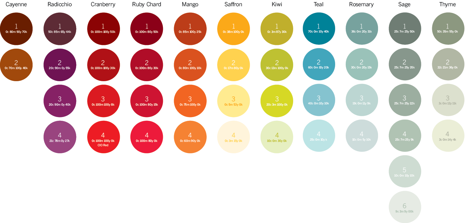
The color palette was expanded, organized and all of the colors were named after edibles. Much easier to remember that CIO green is "Kiwi" rather than 30m + 87y + 30k.
The cover redesign neatly accommodated a new trim size and some very restricting new postal labeling requirements.

Showcasing shorter content for a big impact
To maximize the use of short-form online content, six section themes were defined: Start, Run, Grow, Thrive, Connect and Finish. They form the editorial foundation of the magazine. We wanted the sections to be stylistically related, but not identical.
Bold ruling details and a flexible grid system emerged as CIO’s art director Terri Haas and I sketched out preliminary ideas and refined them.
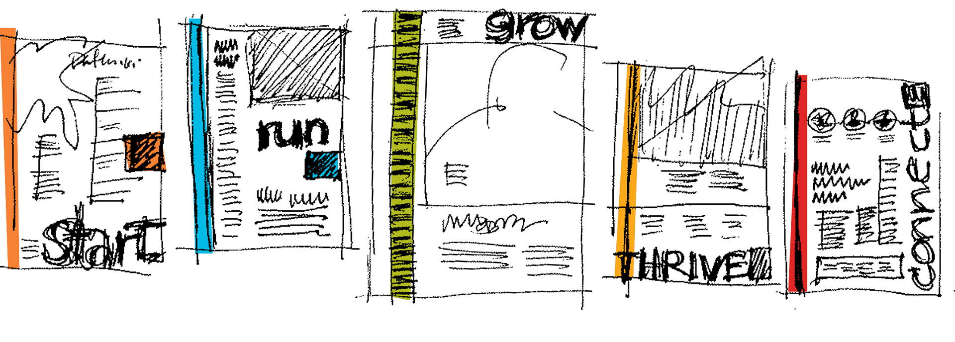
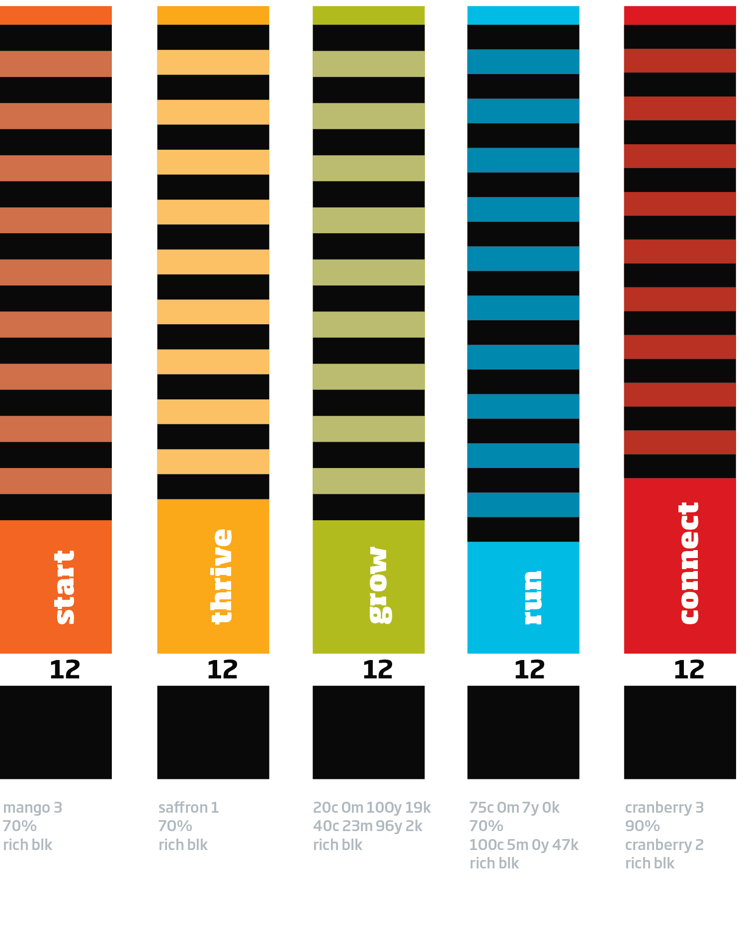
The end result: sections with attitude.
Fun and flexible, and packed with compelling content.

And...a playful ending
The end page took advantage of the countless unusual (and often humorous) stories about technology implementations in unexpected places. As an extra bonus, the content tended to lend itself to the use of dramatic stock images and whimsical headlines. I comped up several of these to test out the concept, and we loved it.
