
PatientsLikeMe: connecting patients, data points and positive outcomes.
PatientsLikeMe has created a unique online platform that allows members to track their health conditions over time and to connect to a community of patients that share the same condition. In exchange for free access to the community and tracking tools, members agree to allow PatientsLikeMe to roll up their anonymized data in reports that are sold to healthcare organizations for treatment research, patient-experience improvements, and trend-spotting. It's a powerful win-win for patients and healthcare providers. Patients get access to a specialized network of members who understand their condition and who share the results of treatments they have tried. Researchers gain access to real-time data about the needs of specific patient communities; what's working, what's not and what's needed.
What started as a small, online networking site for ALS patients in 2004 has grown into a powerful community of over 400,000 patients and 2,500 conditions.

PatientsLikeMe's initial branding was focused on their website — their core product. The key brand color is a saturated blue. Tints of that blue and two grays make up the core palette.

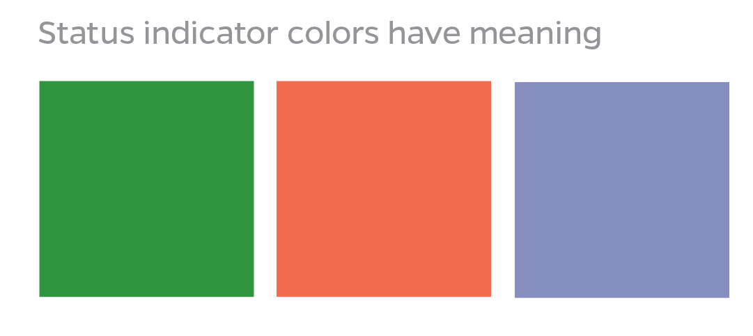
In addition, specific formulas of green, red and purple are used within the site to show plotted patient data. Each of these colors has a specific meaning for members. Green indicates "positive", red is "negative" and purple is "neutral". For the most part, those colors are off-limits for other uses because of their specific associations.
As PatientLikeMe's services expanded, the visual language needed to be extended for client outreach in print and other mediums.
To generate excitement and appeal for the brand, we needed more color options.
I proposed new colors to add energy and excitement to the palette. We experimented with the new colors as we created new collateral pieces. Some didn't fly (like the spicy yellow and hot orange...at least for now...), but the palette has expanded a bit as new pieces are developed, with each new color carefully considered for its fit within the core brand identity. 
The website relied solely on the dependable sans serif Avenir. I recommended adding something warmer to convey the brand's spirit in print.
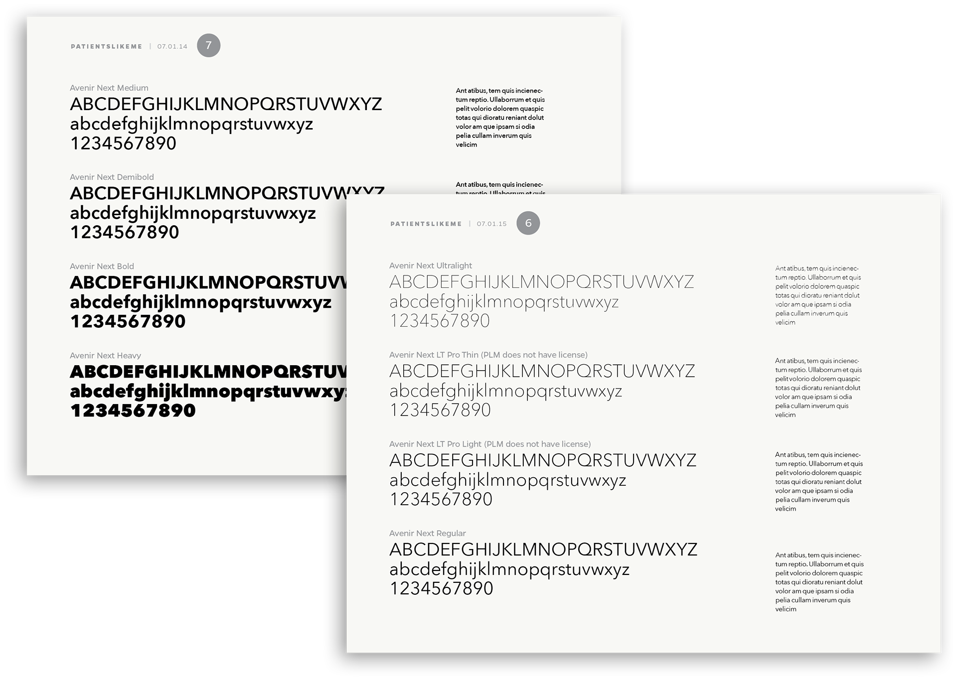
Sentinel is one of my favorite typefaces to work with and gives us some flexibility for headlines, text and large display uses. Sentinel has warmth, an extensive set of weights and numerals with a great amount of character. It works very well with Avenir, providing a pleasing contrast. The italic is very readable and charming, without being too delicate.

We developed brochures to reach out to patients in their doctor's office. Messaging and visuals were deliberately simplified to help make a potentially complex and frightening healthcare journey into one that is streamlined, friendly and supportive. The new, fresh colors and typography helped to convey familiarity and approachability. PatientsLikeMe is the patient's advocate. The brand embraces positive connections, experience sharing and the amazing strength of an understanding community.

A large foldout brochure featured patient stories, data points and a clearly defined pathway to empower the individual through their individual journey.

A smaller, two-sided brochure captured those essential message components and emphasized the "we're here with you and we can help" essence of the brand.

The PatientsLikeMe brand to continues to evolve to meet the growing needs of the company as they reach out to both potential patient members and healthcare industry partners.
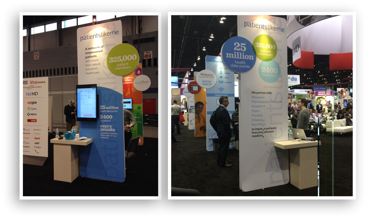
Kiosk graphics at a large healthcare retailer event emphasized the data points about the size and scope of the PatientsLikeMe community, to convey that value to pharmaceutical companies, researchers and providers.