
Building a flexible brand system for a rapidly growing business
Technology for Publishing provides integrated solutions that help publishers transform their content creation strategies, processes, and systems from traditional, resource heavy, paper-based models to fluid content flows and new platforms.

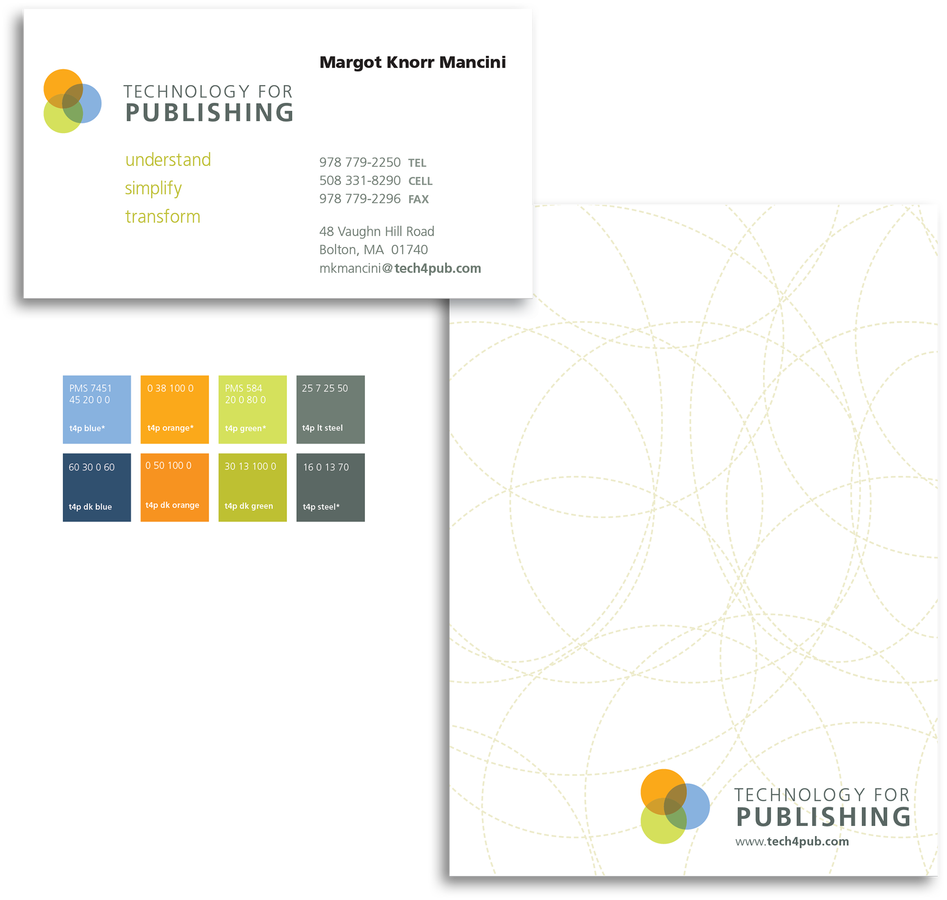
I created the logo and type treatment and developed the new tagline, “Understand. Simplify. Transform”, to capture the process and outcome of Technology for Publishing's unique work.
A defined color palette and updated typography provides consistency across products, e-mail newsletters and promotional materials.
For client case studies, templates are designed for easy on-screen or tablet reading.


Holiday cards carry the brand elements with a playful twist.

Images for the Technology for Publishing's home page promote new products with strong color and headlines.

Versatile ad units are designed to stand out on TFP's website, blogs and newsletters.


Handbooks and training materials for client training programs feature clean layouts and crisp elements keep the complex content easy to absorb.
